Your cover looks right at full size on your own screen. In a store grid it collapses into a smudge with a word nobody can read. The book cover thumbnail test catches a weak cover before you upload it. You view the cover at the width a store really shows it, drop it beside the covers it competes with, and judge the silhouette, the contrast and the title in that order. Failing one of those three points to one change, not a redesign.
What is the book cover thumbnail test?
The book cover thumbnail test is a legibility check. You view your cover at the size a store shows it in search results and browse grids, sitting next to competing covers, then decide whether a shopper can read the title and name the genre at a glance.
A thumbnail is the small version of your cover that stores put in search results, category lists and recommendation rows. It is the first and often the only version a reader sees. The full-resolution file you have been staring at for weeks is the version almost nobody meets first.
Full-size review tells you little because you are the worst available judge of your own cover. You already know what the picture shows, so your eye fills in detail that a stranger's eye never receives. The test removes that advantage by giving you the same information a shopper gets: a small rectangle, in a row of other small rectangles, for about the length of a blink.
How do you run the book cover thumbnail test?
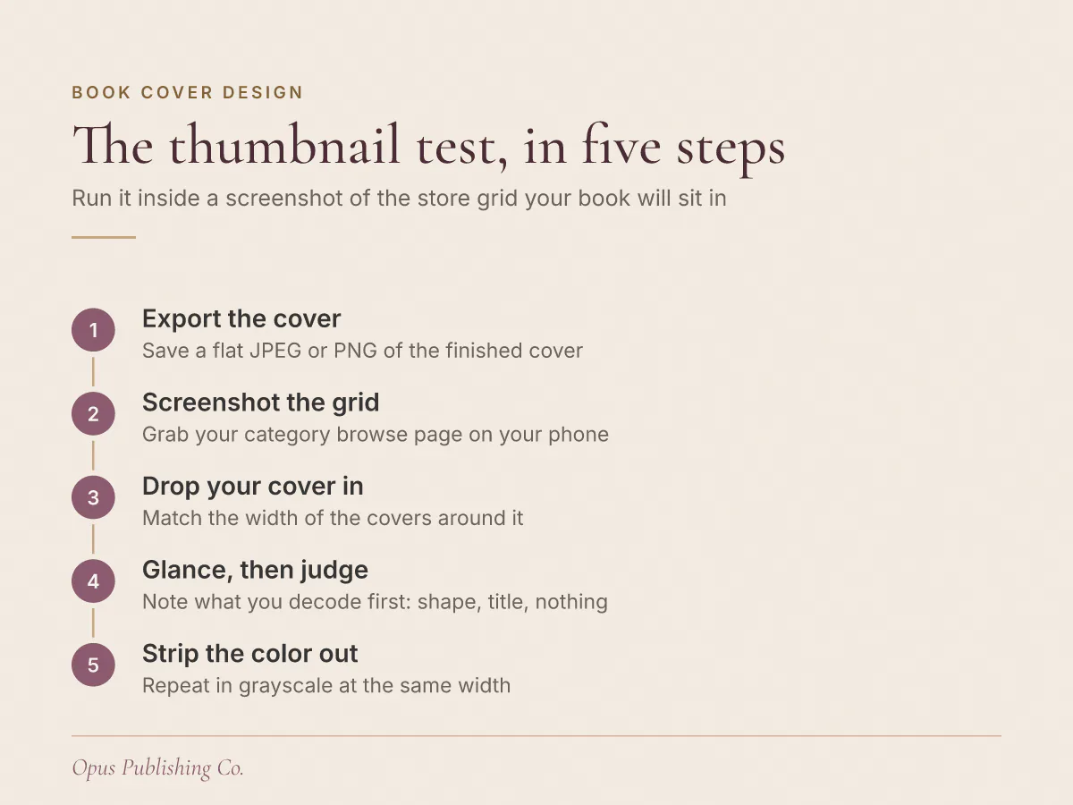
Run the test in the store, not in your design app. Open the category your book will sit in on your phone, screenshot that grid of covers, scale your cover to the same width as its neighbors, and paste it in. Then look away and glance back.
The steps, in order:
- Export a flat copy of the finished cover as a JPEG or PNG. No layers, no mockup, no spine.
- On your phone, open the store page where readers browse your genre and screenshot the grid of covers. Browse the KDP categories you plan to publish into, since those grids are where your cover has to compete. KDP is Amazon's Kindle Direct Publishing platform, and Apple Books, Kobo and Barnes and Noble Press all show covers in the same kind of grid.
- Scale your cover down until it matches the width of the covers in that screenshot, and drop it into an empty slot.
- Look away for a moment, then glance back at the grid once. Note the first thing you decoded: a shape, the title, or nothing at all.
- Repeat the glance on a laptop at browse-grid width, and again with a grayscale copy.
Your cover passes when four things are true:
- You can read the title without leaning toward the screen.
- Someone who has not read your book can name the genre from the thumbnail alone.
- Your cover separates from the covers either side of it instead of blending into the row.
- The main shape on the cover still reads as a shape, not as texture.
Anything less is a fail, and a fail is useful: it names the element to fix.
What size should you test a book cover thumbnail at?
No single book cover thumbnail size exists to design against. Stores adjust their layouts, and the same cover appears at different widths in search results, category grids, recommendation rows and mobile apps, so the practical target is the smallest width you can actually find your cover at today.
The pixel figures that circulate in cover advice online contradict each other, and none of them cites a platform's own documentation. Chasing one of those numbers gives you false precision about a layout you do not control. Your own screenshot is a better ruler, because it reflects the device, the app and the placement that your readers use.
Two habits cover most of the variation:
- Test at the smallest width you can find, usually a mobile browse row. A cover that survives the smallest placement survives the larger ones.
- Hold the phone at arm's length rather than close to your face. Distance simulates the attention a shopper gives a row of covers they are scrolling past.
If you want a desk-side version, print the page of covers at actual size and pin it to the wall across the room. Paper removes the temptation to zoom.
What makes a book cover title readable at thumbnail size?
A readable book cover title has mass, not just size. Thick letter strokes, few words, strong separation from whatever sits behind the type, and some empty space around it. Thin scripts, tight letter spacing and a seven-word title stacked over a photograph are what turn into a gray smear.
Mass is the useful idea here, because authors reach for point size first and run out of room. Cutting words is the cheaper move. Fewer words let the same area carry taller, heavier letters, and a short title holds its shape when it is reduced.
What to change, roughly in order of payoff:
- Word count. A long title fights the cover. Cut an opening "The" that earns nothing, and move the subtitle into the ebook description rather than onto the art.
- Stroke weight. Choose a face with thick strokes and open counters, the enclosed white shapes inside letters like o and e. Hairline serifs and calligraphic scripts are the first casualties of downscaling.
- Letter spacing. Slightly looser spacing keeps letters apart at small sizes. Tight tracking, the overall spacing across a line of type, lets them fuse into one dark block.
- Flat type. Drop shadows, bevels, outer glows and gradients inside letters all add noise that does nothing at thumbnail width.
- Hierarchy. Title dominant, author name clearly secondary, series line smallest. An author name larger than the title only works when readers are searching for the name.
Say you have a 70,000-word literary debut called The Weight of Quiet Water, set over a coastline photograph, with your name across the bottom. At full size it reads as calm. At thumbnail width, four words of thin serif type over moving water read as nothing, while your name, set in a heavier face on plain sky, reads perfectly. The hierarchy is inverted and the fix is in the type, not the photograph.
How do you test a book cover for contrast?
Strip the color out. Save a grayscale copy of the cover, shrink it to thumbnail width, and check whether the title separates from its background. A book cover contrast test in grayscale catches pairings that look rich on a monitor and merge into mud when small.
Grayscale works because lightness difference is what survives scaling. Reducing an image averages neighboring pixels together, so two colors of similar lightness, such as a mid-orange title on a mid-teal sky, blend toward a single gray even though they look like a bold contrast at full size.
Three checks, in order of harshness:
- Grayscale at thumbnail width. The title should still be obvious. If you are hunting for it, no reader will find it.
- Low brightness. Turn the phone's brightness down and look again. Dim screens flatten dark covers first.
- Squint. Blur your own vision until detail drops away. What remains should be the title and one shape.
The usual culprit is type sitting on a gradient or a photograph that changes lightness behind the letters. Fixes that work at small sizes: move the type onto the flattest, most even area of the image, darken or lighten that area behind the type, or set the title on a solid plate of color. Outlines and glows around letters tend to make the smudge worse, not better.
Why do busy book covers fail at thumbnail size?
Busy covers fail because a thumbnail has room for one idea. Fine detail averages into gray when an image is reduced, so a cover carrying three competing elements arrives as texture rather than as a picture of anything a reader can name.
A focal point is the one shape a reader's eye lands on first. A book cover focal point has to survive as a silhouette, the outline shape left when all the detail drops away: a figure, a face, a house, a knife, a single tree. If you cannot describe the cover's main shape in four words, the thumbnail has no focal point, and the reader has nothing to grab.
Two fixes beat all others, and both reduce rather than add:
- Crop in. A subject that fills the frame survives reduction. The same subject small inside a wide scene disappears.
- Cut elements. Remove secondary objects, extra text, borders, badges and texture overlays. Every element you cut gives the survivor more weight.
Children's books and literary fiction both run into a version of this problem, from opposite directions. A children's cover often carries a full illustrated scene with several characters. A literary cover often carries a subtle photograph with no clear subject. Both lose at thumbnail width, and both improve by choosing one element to be the cover and letting the rest sit behind it.
What are the most common ebook cover mistakes at thumbnail size?
The most common ebook cover mistakes at thumbnail size are a thin or script title, a subtitle given equal weight, a scene with no single subject, and text on a background of the same lightness. Each is a decoding failure rather than a question of taste.
| What breaks | How it looks in the grid | What to change first | Pass check |
|---|---|---|---|
| Thin or script title | Title reads as a gray ribbon | Swap to a heavier face, cut words | Title legible at arm's length |
| Title on a gradient | Half the title visible, half gone | Move type to an even area, or add a solid plate | Title holds in grayscale |
| No single subject | Cover reads as texture or weather | Crop into one subject, remove the rest | Main shape describable in four words |
| Subtitle at title weight | Two lines compete, neither wins | Shrink the subtitle, or move it off the cover | Title decoded before anything else |
| Print finishes in the digital file | Foil and emboss flatten into dull patches | Design the digital cover on flat color and value | Cover works with no texture effects |
One more mistake does not fit a table: judging your own cover alone, in your design app, at full size. The grid is the only honest venue, because the test is partly comparative. A cover can be well made and still lose to louder neighbors in the row.
What to fix first, and what to do this week
Fix in this order: silhouette, then contrast, then title mass, then detail. Changing one element at a time tells you which change did the work, and it stops you re-rendering a design that was already close.
This week:
- Screenshot the browse grid for the categories you are publishing into, on your phone, tonight.
- Run the test and write down the first element that failed. One element, not a list.
- Make that single change, then re-run the glance on the same screenshot.
- Ask two readers of your genre to name the genre and read the title from the thumbnail only. Do not tell them what the book is.
- Once the digital cover passes, move to the print wrap, where the KDP cover template zones set the spine, the barcode area and the bleed, the extra margin trimmed away after printing.
If you would rather hand the revision to a designer, send them the screenshot and the failing element, not just the cover file, whether that is through book cover design at Opus or someone else working in your genre. A designer who knows which element failed can fix it in one pass instead of three.